
Late last year, Justin Bieber released Purpose. The album was as much of a hurled apology as it was a hit record. It was also the climax of the pop star's very public, and seemingly never-ending, story of personal redemption. Even after all of the painstakingly forced publicity stunts, the album had to be good—and it was. Since then, Bieber has made strides toward successfully repairing his fractured public image and switched his focus to reinvent his stage presence, and, notably, his personal style.
“His approach to fashion has evolved the way his music has evolved,” Bieber's stylist Karla Welch told Billboard earlier this year. Welch, who has been working with the singer since 2012, went on to list some of the heartthrob's favorite brands: Raf Simons, Fear of God, Rick Owens, Saint Laurent, and Supreme. While the list may scream “reads Four Pins once,” it sure as hell beats the purple American Apparel hoodie and high-top Supras uniform that performer lived in for most of his teenage years. When the time came to design the Purpose Tour merch, another opportunity was presented for Bieber and his inner circle to show off the singer's personal style progression. His rise to "best dressed" level has been well-documented, and it was the perfect chance to reinforce the Biebs' status as a modern-day style icon. Much like his latest album, he wasn't going to settle for average—the merchandise itself had to be consistent with the new and improved Bieber.
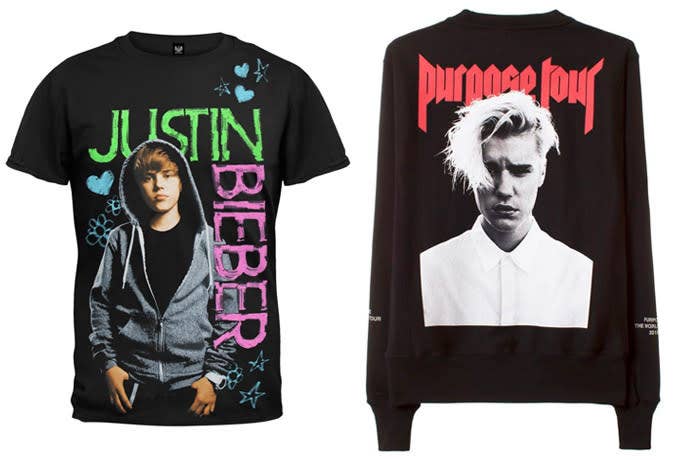
The Purpose Tour began in Seattle, Wash. this past March, but the first rumblings of the logo started a year prior when illustrator Mark Riddick was first introduced to designer (and friend of Bieber) Jerry Lorenzo. It was Joe Perez, an art director at Kanye West’s creative agency DONDA, who introduced the two. Lorenzo had originally stumbled across a passion-project-turned-published-book that Riddick wrote and compiled, entitled Logos From Hell. The book contained 600 pages of logos and illustrations from the world of extreme, underground metal. The very nature of the book captured Lorenzo's attention, so he reached out to Riddick very early on in the creative process.
Mark Riddick and Jerry Lorenzo existed in completely different worlds before working together. Riddick is an icon within the metal genre; he’s been a consistent creative force who grew up within the underground scene and has been designing for both bands big and small since 1991. In contrast, Lorenzo is armed with a business degree and comes from a world of professional athletes and tastemakers. He worked in sports marketing and consulting before he entered the next chapter of his career as a fashion designer with his hit label, Fear of God. Despite having little common ground, the talented duo would bond over their mutual love of heavy metal visuals, joining forces to create one of the most-talked-about logos (and tour merchandise collections) of the year.
“The direction from Jerry [Lorenzo] was fairly minimal,” Riddick recalls to Complex. “He simply referenced some classic metal logos, such as bands like Death Angel, Motorhead, Testament and Megadeth.” With this simple direction, Riddick went to his drawing board and soon shared a number of rough sketches with Lorenzo. The fashion designer had even shared a logo sketch of his own. "Jerry had already formulated a logo based around the typography used on Black Sabbath’s Sabbath Bloody Sabbath album. In my opinion, the Purpose Tour logo looked too similar to a well-known doom metal band local to my area called Pentagram," says Riddick. After plenty of back and forth, the duo decided the original version created by Lorenzo was still the strongest, despite the similarities.
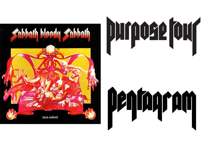
It was clear that the biggest influence on the set of logos was the iconic look and feel of classic metal. "I'm just as much a fan of vintage metal T-shirts as I am of the music. I loved how the merch was part of the band's style both on and off stage back in the day—it was super real back then," explains Lorenzo. With one of the logos approved for print, the pair switched their focus on a wordmark for "Bieber."
Riddick was tasked with creating a design in the vein of the Thrasher Magazine logo, which is famously based off the Banco typeface created by Roger Excoffon in 1951. The illustrator stayed true to the request, but opted to exaggerate the sharp edges to give the logo a more menacing and aggressive look. "I provided several different interpretations of the logo for review; however, they opted for the tamest version, given Justin’s fan demographic. I don’t believe it was the coolest or strongest logo option, but that decision ultimately rested with my client," Riddick notes. After all was said and done, the illustrator had provided multiple rounds of concepts and logos to Lorenzo and team.
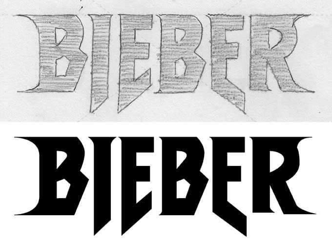
Despite the high-profile client, Riddick found the process to be very similar to that of his usual clients: sketch, then refine, and then finalize in vector format. The main difference? The hype and attention that surrounds anything relating to Justin Bieber. "Jerry certainly pushed me to get the result he was looking for. Even though it was a lot of work, I can respect that he is an artist with his own particular vision," Riddick recalls of his time spent working with Lorenzo. "He has a definitive approach to his fashion, and I think that distinction is what sets him apart from other designers."
Between the unflinching deadlines, multiple rounds of revisions, and expedited timeline, it was by no means an easy assignment. However, the end result was clearly worth the effort from all parties involved. Fans have waited in line for hours to get their hands on the merch at pop-up shops in New York and Toronto, and the official online shop is currently sold out. Much like his music, Bieber's merch managed to transcend just his Beliebers. When asked about why this look was right for the reinvented pop star, Lorenzo replied, "Justin is just as much rock as he is hip hop."
That answer alone seems to describe the process in which the Purpose Tour logos were created: the result of a diehard metalhead and a fashion designer trying to create something that will stand the test of time and speak to the new Justin Bieber.

